Time to get started with the theme design huh?
Yep..
How are you going to go about doing that?
Well first I guess I'll Google "Theme design." or "UI design" or "Hud Design"
Don't you feel supremely unqualified to design a Hud? You've never done it before.
Whoaa I'm so negative today.. Well there's a first time for everything. :)
*Goes to Google*
After reading this: http://gamedevelopment.tutsplus.com/tutorials/game-ui-by-example-a-crash-course-in-the-good-and-the-bad--gamedev-3943
I feel that I definitely have no idea what I'm doing. I thought I would just make some nice background images and stick then behind the bars and buttons. Now I'm ready to meditate for a month on the existence of life. Start with the basic questions first, I say.
What design do you want?
Yeah, I want something that's Korean-esque. The game has lots of Korean themes, maybe we'll even say it's set in Korea. Here are some reference images that appeal to me:
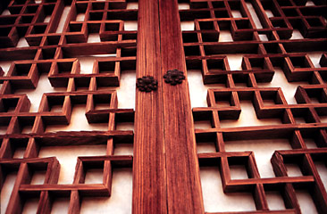
The plan was to use these shapes and patterns in various parts of the UI.
I think that's fine, let's start figuring out what the UI consists of.


Parts of the UI:
- Life bar
- Energy bar
- Bottle count
- Timer
- Joystick
- Attack/Special Buttons
We also need a menu button right? Anything else? It's probably time to play some games and see what kinds of buttons they have.
First up is Zenonia 5, what do you think of it?

Zenonia 5 is a great looking game, but after my 10th "Kill 15 Crocodiles and bring me their meat" quest, I felt burned out. I'm past that stage of my life where I want to feel like I'm working by grinding away, fulfilling a game's menial demands.
Now I demand something more mentally stimulating! I demand the game of making a game.
But Zenonia 5 is beautiful. And that Hud looks awesome.. So let's see.. what can we cherry pick? First of all, those buttons on the lower right side are very small. I think that works well for them because they don't have any combination button presses. Will we?
Secondly they have this nice metallic circular theme with lots of blank space. We can also set the Opacity to be lower I believe.
Thirdly they have a shop button.. Do we want a shop button? We were planning on selling a costume and pets.. But putting that button on the main part of the screen would be rather annoying, when players are trying to see bottles or other items. But now we are not selling anything!
Let's take a look at another game: Shadow Fight 2

Two bigger attack buttons in the lower right.. but look at that huge touchpad on the left. Does it need to be that big? Were they worried players might want to see their character?
This game also lets you buy stuff, but happily no store button. Now I totally don't feel pressured to have one.
One key difference in play between Shadow Fight and Bottle Smasher is the auto-facing design. Our character always faces the enemy. For us, we have to decide if we want to have front and back attacks or only front attacks. Do we want to make the player work harder? Will that be more rewarding for them? I don't know.. This seems like the kind of thing to decide through play testing.
What are you thinking?
What kind of design to do.. Do we want a 'wood' feeling? The bottle counter going dead center at the top actually might be distracting since we have a vertical attack and bottles are landing on top of us a lot. Let's put the bottle counter and the timer in the upper right. And a little menu button in the bottom center.
Also green for the life bar might not be so great since the bottles are green too. Let's make the life bar red like in these games.
Zenonia's upper left has a little face and level and exp counter, but we don't need that face. Right? It's just getting in the way of the valuable screen space right? Right? So let's just use the 'door' design to give our life bar and our buttons a little zest. I've got some ideas, time for a mock!
*much time later*

Here is the current mock and the direction we're going. The top elements need to be redone more sharply and with some color control, perhaps chromified. My inner critic #8 is telling me that the circles on the bottom and the designs on the top don't match and that this is not good. He says that people will possibly make comments about it, and that they will lose respect for the game. He might be right, my inner critic. However I am perfectly happy with the shape differences.
The menu button needs some love, how about a little 'see through white rice paper' kind of effect? Yup that looks good. Another thing I'm wrestling with is adding a timer. I'm somewhat leaning against it.. The 'special' button will need to become a kind of 3 option slider roller ring thing, considering making it look 3d but not sure yet..
Okay next let's get to work on mocking up the new game screen, the explanation screen (loading), and the results screen! Good luck!
P.S. The move hasn't completely destroyed productivity~ So far UAE seems alright, it's only been a couple days but the people are very friendly!
No comments:
Post a Comment