Tuesday, March 22, 2016

In a Slump

You're in a slump?

Yep, once every couple months I go up and down, and a couple days ago I was very down.

What was wrong?

Basically short term money stress, something 99.5% of you can understand.  Because even rich people get money stress sometimes.

I can't figure out how to get money in the short term in a way that makes me not hate my life..  Currently I'm in the UAE and there's not much here I can do.  

Can you do freelance artwork?  

I wish I could.. the second reason I'm in a slump.. is that people don't like my art very much.  I don't know why exactly but people just don't.  I've thought long and hard about it and it comes down to two things.  

The obvious one is the lack of technical skill, I'm still amateur.  But if you look at Deviantart there are thousands of examples of amateur pictures being very appreciated.  

The second thing, as my girlfriend pointed out, my pictures aren't special.  There's nothing really interesting or mysterious or thoughtful about them.  I don't really try to put a message into the pictures.  They're just pretty and empty.

Thinking about this caused me to go into a pretty severe two day laying on the bed coaxing myself to exist depression.

The problem is.. I don't have a message.. 

The reason for that is.. I don't value communication about serious issues.. things that are important to me.  

Why is that?  

I once read a quote that impacted me quite a lot.. It goes something like "between two equally learned men, conversation has no purpose."

That idea, combined with the experience that trying to change someone else's mind about something is a bad way to communicate, leaves me with: learning something from others, and joking around, as my two main attitudes.

Which is fine, I get along fine with most people and I enjoy their company.  Except now that I'm trying to make art that people like, and failing, I'm forced to examine both my art and myself deeply.

What will you do now?

Two things.  I'm going to try to develop a painterly feeling art style and improve my background skill to try to get some freelance work.  Anime style isn't in very high demand.

I'm also going to try to put more value on communication.  Putting myself out there, opening myself up to let others try to change my mind, learn more about them, try to foster a lifestyle of connectedness.  Having a desire to communicate is probably the basis of putting some feeling or emotion or message into an artwork that people can feel attraction to.

Is art more important than your game?

Let's say they're equally important.  I've got to be realistic and say that since there are 300 new games coming out on Android per day, mine is unlikely to make any money.  Unfortunately things come back to money in the end, way too often.  If I had some kind of fan base who liked my art, they'd be interested in playing my game.  Which brings us back to square one..

How's the art coming?

It's good, there are more collections of resources on Youtube now than ever before. 


This is a wicked cool collection of Chinese painters, they're getting me all inspired.


Hopefully after a few days of painting I'll be feeling ready to tackle the attack animation.  I've struggled with backgrounds for so long I'm really hoping to get the hang of them..

Let's see what we churn out!


Saturday, March 19, 2016

Walking Animation

How was your trip?

Awesome!  Istanbul and Amsterdam were both well worth visiting.  People around the world are very kind.  They are also a bit pushy and will definitely try to help you part with your money.  Also.. man.. Istanbul has a lot of refugees from Syria.. They'll ask you for money too, and I urge you to give as much as you can.  

Watch out for the experienced swindlers though.. that money would have made me happier if it went to the kids or musicians playing on the grand strip.

What's up for today?

Well the walking animation is passable by itself, needs a little more work, but we really need to see it side by side in the game and judge how it matches the resting animation.  I'm very worried that the perspective is too different between them and it will look awkward.


Great let's throw it in and see!

Yep that's the idea but it's been so long since I added an animation I can't remember what all the steps are..  And, lo and behold, there are no comments in the code.. I was saving that for the great refactoring which.. I assume will still be great when it happens.

Well after just a little bit of mucking around, we've got it in the game!  Here's the little update:


Next we'll work on the attack animation!  I'll be making a Youtube tutorial video out of that one.  It will be long and arduous.  We'll get there though!

Friday, February 12, 2016

Resting Animation

Woo long time no see!  How's it going?

Pretty good!  Dubai is great so far.  It's nothing like what I imagined.  Haven't been able to get my workstation set up yet so I've been roughing it on the Surface Pro 2.  Gotta say though, even though it's such a pain to use, it still lets me get the job done.  4x more slowly, but hey, I'm not complaining.  If I were complaining though, would anyone send me a Surface Pro 4?

How's the animating?

Definitely going to try to get away with doing rough colors on a rough sketch for the attacks.  Doing the lines and accurate colors takes about 10x more time.  So.. I guess I've spent about 40x more time on this one animation than I should have.  Sounds about right.  


The one on the left was done roughly and took about 20 minutes for coloring.  The one on the right took about 4 hours for lines and coloring.

So why aren't you doing them roughly now?

Ahh fear I guess.  I guess I'm just scared that if it's not perfect then it won't be good enough.  Which brings us back to where we are now.  

Now all the lines are "done" for the 15 frames and we're going to color the first one so we can figure out how long it takes and what it feels like to color on the SP2.  Doing lines feels like I'm drawing with both hands tied behind my back.  Like using my feet I suppose.

Here is what the line animation looks like.  It doesn't inspire a lot of confidence compared to the sketch, but I'm pretty sure it will serve our purpose:

This is how we make the shadow forms:
Another thing I've got to be more honest about is the viewing resolution.  I'm 99% positive I won't try to do a PC version of the game so I don't need the assets to be the big 3500px files they are.

Since the images are so small it's tempting to throw rough versions into the game.  I could spit out an animation or two every day at that rate.  I've been considering making a different game with an art style like that, just to experiment.    

Next we'll take the first frame to completion so we can get used to doing things on the demon tablet. Just a reminder, don't purchase an SP2 for art!


This is about right, give or take a few tweaks here and there.  This first frame was done with a typical base/shadow/gradient layer set for each part.

Next we spend a few seconds agonizing about how long this will take.  Let's also congratulate ourselves for getting so much done on the tablet of chaos.  I'm also a little nervous since the first time I tried to animate something with values it didn't come out well.. this is partly experimenting @_@

*time passes*

Drawing leaves a lot of the brain open for musing.  Programming on the other hand occupies all of my language center in a protracted expletive.  Here are some musings.  

What if no one wants to play this game?  Am I okay making this game even if not one single person plays it?  Hmm the answer is probably no.   But the reality will probably be a painfully similar "Not enough people play it to make more than 1$/10$/100$" 

How can I market this game?  What is marketing?  It's where we build up the appeal of something right?  We make implications at deeper meaning and hint at hidden satisfactions.  We say why they need to play this game.

I'm defeating myself a lot here, I can't find a reason why people should play this game.  It's just a game.  Play it or don't.  But that attitude must be wrong right?  What about games that I get excited about?  Why do I get excited about them?  Why do I want to play them so much?  For me.. I like big open world games of exploration and adventure.  I like the experience.  The story.  But I don't have to actually play to get that experience.  For me the games I've enjoyed lately have all been through watching Let's Plays.   

At least I'm being productive while I self destruct~

 I'm so crazy slow but some frames can be copied over with minor changes.


Looks like we're on the right track but the hair will need a little stylizing.  Also I'm thinking since this will be an infinite type game that we should have 3 difficulty modes.


The intuos+surface combination is quite likely the smartest thing I've never done in my life.  I had to wait until someone (thanks my lady) suggested I do it.  In what is probably a first for humanity, there were no driver conflicts.

I'm also seeing that the cuff on the left arm shouldn't be so stiff at the end, it should move a bit to the right..  Is it fixable!?  Yep looks like it.

Here we have some more booby bounce.  Again this was at the direction of my special someone.  "I wish the boobs would bounce more."  She said when looking at some of the earlier WIPs.  I'm not sur why I feel it's necessary to explain that.  I mean I personally also like having the bouncy boobs.  I guess I'm a coward when it come to sexually provocative things.  Good thing she's brave!  ^^;

The hair, as always, is difficult for me.  Luckily most of the issues disappear at the viewing size closer to what we'll see on a cellphone. (Tiny)


After getting to this point I had to ask for feedback.  Luckily my girlfriend was there (again!) to let me know the hair wasn't working for her.  She wanted it to be bigger and have a nice swaying motion.  I had seen an animation on Facebook recently, but as you may or may not know depending on your century, Facebook uselessly doesn't have a way to look up the "history" of what you've seen.

We made a little sketch of how the motion might go:


We're just about at a merging point anyway so we merge each frame's layers and then throw some white on top to give us a drawing surface:


And after much much trial and error I'm 98% satisfied with this one:


Well, one frame was driving me nuts.  Can you guess which one it is?  After chopping the time in half and making an extra frame and giving the hair a little extra movement I'm much happier.


And then much mucking around later, we have this:


It's not finished, but for now we'll stop working on it.  Recently someone trotted out the old "Art is never finished, only abandoned" quote and I snorted.  Scoffed.  Disbelieved.  Ah, what a naive soul I was, two days ago.

Whoa finally.  Good job!  What's next?

Next let's get this bad boy into the game!  Which if I'm not mistaken is also a great time to fix the nagging "left/right" orientation distance jump.

Tuesday, February 2, 2016

Hud theme design

Time to get started with the theme design huh?


Yep.. 

How are you going to go about doing that?  

Well first I guess I'll Google "Theme design." or "UI design" or  "Hud Design"  

Don't you feel supremely unqualified to design a Hud?  You've never done it before.

Whoaa I'm so negative today.. Well there's a first time for everything. :)

*Goes to Google*


I feel that I definitely have no idea what I'm doing.  I thought I would just make some nice background images and stick then behind the bars and buttons.  Now I'm ready to meditate for a month on the existence of life.  Start with the basic questions first, I say.

What design do you want?

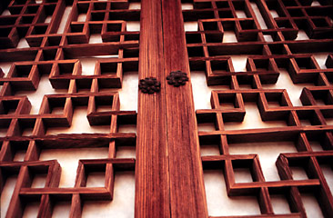
Yeah, I want something that's Korean-esque.  The game has lots of Korean themes, maybe we'll even say it's set in Korea.  Here are some reference images that appeal to me:

The plan was to use these shapes and patterns in various parts of the UI. 

I think that's fine, let's start figuring out what the UI consists of.


Parts of the UI:
  • Life bar
  • Energy bar
  • Bottle count
  • Timer
  • Joystick
  • Attack/Special Buttons
We also need a menu button right?  Anything else? It's probably time to play some games and see what kinds of buttons they have.  

First up is Zenonia 5, what do you think of it?

Zenonia 5 is a great looking game, but after my 10th "Kill 15 Crocodiles and bring me their meat" quest, I felt burned out.  I'm past that stage of my life where I want to feel like I'm working by grinding away, fulfilling a game's menial demands.  

Now I demand something more mentally stimulating!  I demand the game of making a game.


But Zenonia 5 is beautiful.  And that Hud looks awesome.. So let's see.. what can we cherry pick?  First of all, those buttons on the lower right side are very small.  I think that works well for them because they don't have any combination button presses.  Will we?

Secondly they have this nice metallic circular theme with lots of blank space.  We can also set the Opacity to be lower I believe.

Thirdly they have a shop button..  Do we want a shop button?  We were planning on selling a costume and pets.. But putting that button on the main part of the screen would be rather annoying, when players are trying to see bottles or other items.  But now we are not selling anything!

Let's take a look at another game: Shadow Fight 2

Two bigger attack buttons in the lower right.. but look at that huge touchpad on the left.  Does it need to be that big?  Were they worried players might want to see their character?

This game also lets you buy stuff, but happily no store button. Now I totally don't feel pressured to have one.

One key difference in play between Shadow Fight and Bottle Smasher is the auto-facing design.  Our character always faces the enemy.  For us, we have to decide if we want to have front and back attacks or only front attacks.  Do we want to make the player work harder?  Will that be more rewarding for them?  I don't know..  This seems like the kind of thing to decide through play testing.   

What are you thinking?

What kind of design to do..   Do we want a 'wood' feeling?  The bottle counter going dead center at the top actually might be distracting since we have a vertical attack and bottles are landing on top of us a lot.  Let's put the bottle counter and the timer in the upper right.  And a little menu button in the bottom center.  

Also green for the life bar might not be so great since the bottles are green too.  Let's make the life bar red like in these games. 

Zenonia's upper left has a little face and level and exp counter, but we don't need that face.  Right?  It's just getting in the way of the valuable screen space right?  Right?  So let's just use the 'door' design to give our life bar and our buttons a little zest.  I've got some ideas, time for a mock!  


*much time later*


Here is the current mock and the direction we're going.  The top elements need to be redone more sharply and with some color control, perhaps chromified.  My inner critic #8 is telling me that the circles on the bottom and the designs on the top don't match and that this is not good.  He says that people will possibly make comments about it, and that they will lose respect for the game.  He might be right, my inner critic.  However I am perfectly happy with the shape differences.

The menu button needs some love, how about a little 'see through white rice paper' kind of effect?  Yup that looks good.  Another thing I'm wrestling with is adding a timer.  I'm somewhat leaning against it..  The 'special' button will need to become a kind of 3 option slider roller ring thing, considering making it look 3d but not sure yet..

Okay next let's get to work on mocking up the new game screen, the explanation screen (loading), and the results screen!  Good luck!

P.S. The move hasn't completely destroyed productivity~ So far UAE seems alright, it's only been a couple days but the people are very friendly!

Monday, February 1, 2016

Project Reorganizing

Reorganizing?  What does that mean?


Talking with a friend helped me realize that the goals of this project need to be restructured.  I need to reduce the timeline way way down.  Cut out a TON of content.

Don't you like this project?

I love this project!  The programming is always rewardingly difficult and learning animation is incredibly INCREDIBLY helpful!

What was your goal for this project?

Yeah they definitely changed.  Originally the goals of this project were: 
- To make a first game and finish it
- To make a precursor game for a bigger version
- To relearn programming and gear up for a bigger different game

Then in the middle, after diving into animation and the Libgdx framework and getting excited about the possibility of earning money with it, and finding myself loving the process, I went into full on feature-creeper mode.

However the problem is that the game itself isn't one I'm passionate about.  I don't think "this is a game that needs to be made."  The problem is that there is another game I feel incredibly passionate about.

If I could be sure that this game would be a money maker, I would of course finish it in all of its 1.5 year long development glory.  And if people get excited about a smaller version of it, I'm more than happy to keep going with it.  However as I'd like to be a game developer, as a career and actually make a living, as opposed to the slowly dying I'm currently doing, I need to make the economic choice.  I've got to invest my time in the game I believe in strongly.

So this game's focus is going to be re-oriented as an infinite smasher.  Less levels, less effects, less attacks, less everything.  I'm satisfied with this decision.

Well, back to the Hud design as that hasn't changed much regardless of this "refocusing."


Saturday, January 30, 2016

Painless Fonts~

How'd it go?


Finally something without hidden complications!  Fonts are a breath of fresh air.  Making them and using them is too relaxing! 

On a side note, I cannot recommend the Surface Pro 2. That probably doesn't matter much since the 4th version is what people are looking at now.  Still.  STILL.  Don't buy a Surface Pro 2.  The number of random issues is greater than the number of random perks.  

  - The track pad mouse on the keyboard will randomly get 'sticky' on some location and snap back to it like a rubber band.  
  
  - Sometimes disconnecting the keyboard causes a hard reset

  - Home and end keys stopped working for some inexplicit reason.  Probably because I need them.

  - The screen pen accuracy varies from one end to the other.  As an artist this is a mojo destroyer level 99.

  - Sometimes the mouse will wobble uncontrollably and taunt you.  You know that disconnecting the keyboard could reset the computer, but it won't stop wobbling.  Like right now

  - Want to use your fingers?  Sorry those buttons are too small, not going to happen.

  - Waking the Surface up from sleep mode teaches me to be thankful to my mother for her patience when she used to get me up for school.  MUST BE VERY PATIENT WHEN TURNING ON SURFACE PRO 2.

  - Windows 8.1

  - Peeling paint.  Seriously what?
  

  - The dissatisfaction of knowing you're already 2 generations behind.  

  - Ridiculously quiet speakers.  Do Microsoft executives employ mice to design this shit?


Anyway now that you've been suitably warned, back to the font!

This could not be any less quick and painless if it were  _______.  Be creative.

And that is entirely thanks to this video:
https://www.youtube.com/watch?v=dxPf1M7YORU

With a voice on par with Ben Stein, he walks you through every minute detail and after 15 minutes you have the POWER to unleash your CREATIVITY on the UNSUSPECTING citizens of the DRASTICALLY overwhelmed CITIES.

I dunno where this is going.  Trying to do everything on the Surface Pro 2 has driven me insane? Or packing? Moving to a new country?  A little nervous to be going to Dubai.  Hope it goes well, just lots of things to be OCD about. Everything is all packed up, waiting to be re-packed once I've procured a scale.  I've got desktop withdrawal.  All the art is over on it..  Okay enough excuses, let's finally figure out how to draw on this tablet.  

Here's the code for the font scene2d label above:

public void addScore(int value){
    bottlesBroken += value;
    bottleLabel.setText(String.valueOf(bottlesBroken));
}

Constructor:

chunkFont = new BitmapFont(Gdx.files.internal("chunkfive-export.fnt"));
bottleLabel = new Label(String.valueOf(bottlesBroken), new Label.LabelStyle(chunkFont, null));

What are you working on next?

I've been thinking a lot about how to make the level useful, ways to use the space.  The problem is the original intent of the game.

The intent was to be a precursor.  Not a full game.  A taste of a game.  The game I really wanted to make was a Megaman/Blaz Blue combination.  A nice big 2d side scrolling world.  Dialogues, beautiful character effects, attack skills.  But I knew that game would take a long time and people said not to shoot too high for a first game.  

The Megaman/Blaz Blue game is itself just one of the games I want to make.  I've got an idea I'm excited about for an educational RPG.    

So the problem is that breaking bottles and dodging obstacles doesn't really need a big huge world.  We've got to come up with a way to use the space a level provides.  Here are some ideas:
  • Player can collect energy bottles to fill up their special attack bar
  • Run from some attacks that are big  
  • Dialogue trigger points, as the player walks across dialogues will pop up
  • Terrain assisting, like being able to jump off a spot to see higher, see a bottle more clearly
  • Hiding under some parts of the terrain to escape bottles
Any other ideas would be greatly appreciated ^_^

I'm also ready to start mocking up a full Hud with background pictures for the health bars, buttons, etc.. but.. need a real computer to do that..  Arrrr using photoshop on the SP2 feels like I'm doing surgery on the head an angsty pin.


Friday, January 29, 2016

Implementing the Overhead kick

Man with all these different posts, how are you keeping track of which one you should submit first?

Hahahaha

Okay so here we're going to figure out how to implement the overhead kick.  We're just using a rough sketch for the "prototype."  Honestly "prototype" is starting to take on the meaning "Rushed and half assed."  Using unfinished assets, half baked code, unplanned levels.  But that's okay.  Spending a full ass of time is just not practical.  Not to answer those important early questions.
Until now we've been using a pixel as an orientation.  That pixel gets lined up by the code to make sure the animations play in the right place.  


These are two frames from the current 'Jump Kick' animation.  The character doesn't actually go any higher in the image, we let box2d take care of that.  We didn't have to pay attention to the vertical distance in the drawing at all, we just moved it up a tiny bit mostly by accident.  Also please ignore how much bigger one is than the other, thanks.  

Can we do the same thing for our overhead kick?  Can we just delete the white space at the bottom of the image and stick an orientation pixel in there?  Can we just not do that and let the animation determine how high we go?  Can we please be lazy??

No sir.  Not for us, not here.  We have a box2d body that the animation is attached to.  When it jumps, we stay stuck to it.  It makes it easy to handle gravity and ground interactions.  If we don't use the box2d gravity then there might be something strange later, like the player thinks he's doing an overhead kick but really his box2d body falls to its sad death.  So we will use the box2d physics and give the body a push up.  Not unlike the time I made the mistake of helping a girl in a short skirt climb up a metal pole.  Yes both of us didn't think that one through very well.

So yes we will push our box up and then it will fall down with gravity.  Let's look at the overhead kick again with a fake little red happy box2d body.


For our first question we can ask: how high does the box need to go?  Does the box need to stay in sync at the bottom of the character?

Well, yes if we want the character to be able to move right or left while kicking.  If they can do an overhead kick while moving and we want them to be able to jump up on different platforms, yeah the red body box has to stay at about the bottom of the character in the image.


Beyond that we probably don't want a normal gravity interaction with some of our attacks or jumps.  For example as we saw earlier, when we let go of the right button we don't want our guy to slide to a stop slowly.  It's disconcerting to see our character do that.  Other objects look fine but when our in game persona isn't under our direct control it feels uncomfortable.  When we are walking in real life and we want to stop we don't slide to a stop while waiting for ground friction to do its magic on us.

For now we are setting our speed to 0 when the player lets go of the button.  Later we might use a fixture and adjust the friction setting as detailed here: http://www.iforce2d.net/b2dtut/fixtures

Which brings us back to the overhead flip.  We can see that the time spent going up and the time spent going down are very short.  To capture this effect in the game lets first try increasing the gravity for just the character.  Then we'll increase the force of the push.  Later to get some fancy "flying through the air" effect we could try setting her gravity lower during the animation or attack.


Here we set up the bounding boxes for attack, hurt, and orientation.  (Can't see the last one)

Then we use the gdx texture packer to put all the files into an atlas.


Next we load them all up in an XML file to read them into the program.  (Making sure to duplicate the frames that last for .1 seconds instead of .05 seconds.)


Then after loading up the animation and adding a new state and input method (all of which I'll go into excruciating detail with later) we've got our overhead kick!

The last thing is to add another button to the HUD.  Scene2d is not well documented in terms of table layouts and getting things to line up.  It's less like programming and more like playing the lottery.

*Time passes*
Well we played long enough and got what we wanted for now:


And here's the code so you don't have to keep rolling the dice;
controls = new Table();
controls.setHeight(stage.getHeight());
controls.setWidth(stage.getWidth());
controls.align(Align.bottom);
controls.add(touchPad.getTouchPad()).expandX().align(Align.bottomLeft).padRight(stage.getWidth()*.8f);
controls.add(kickButton).maxHeight(stage.getHeight() / 4)
        .maxWidth(stage.getHeight() / 4).align(Align.bottomRight).expandX();
controls.add(kickButton2).maxHeight(stage.getHeight() / 4).expandX()
        .maxWidth(stage.getHeight() / 4).align(Align.bottomLeft);

I gotta say, this new attack makes hitting the high flying bottles a lot more rewarding..  Waiting and trying to get the timing is just difficult enough to be satisfying and not so hard that it feels cheap.